Talking Numbers: The Significance of Statistical Significance

Standard

Statistical significance XKCDStatistical Significance. It’s so basic a concept that many modelers and statisticians don’t look for it in simpler analyses such as marketing campaign comparisons, population distributions and so forth. Nevertheless, statistical significance can make all the difference (pun fully intended) in whether results are jaw-dropping or trash-worthy. And when speaking with the business-side of the house, you’d better know which is which.

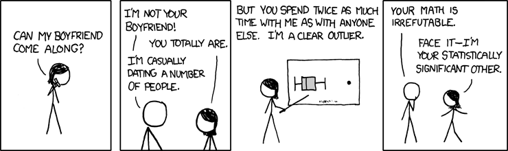
Tip for Translation: Less Insignificant Info is More

First of all, check for significance. That could go without saying… but it doesn’t (see above). If the results are not significant then do not put them out there for the business to jump all over… which they will. If they are close to significant and you want to share them, add a caveat/footnote indicating that the results may be the result of random variation. Do not use technical terms here.

Two common times that analysts try to give flack about this:

“Yeah, but my tests always appear significant because I have enough data that even tiny differences get picked up due to the sample sizes.”
Try bootstrapping smaller samples for comparison and see what happens. If you are still getting significant results, good on ya’. If not, maybe the results weren’t as significant to start with.

“But the business impact of this minuscule difference is huge so therefore it doesn’t matter if the result is significant.”
This is actually even more reason to validate your results. Presumably, if the resulting teeny difference would cause a major upheaval for the business, so too would a minor variation due to natural fluctuation. Use a significance level that aligns with the importance of finding a difference. For a super-important analysis, go with an alpha of .01 or even .001 rather than the usual .05.

To Show or Not to Show Statistical Significance…

More often than not, business stakeholders only want to see results that are significant. They want to know how the analysis can be used to better effect. In general, that does not mean that you go around flaunting a p-value. Just state the results and how to use them and move on. On the other hand, it is usually informative and interesting to business users to see statistically insignificant results when it confirms or debunks a long-held hypothesis.

For example, let’s say that there is a “gut feel” that customers who buy diapers also buy beer. After doing some testing on purchase data, you find that there is no significant link between these two product categories. The business stakeholders (and holders of the gut feeling) would likely need to know that these two items are not correlated. It impacts store and display layouts for the future.

Got some great examples of significant results that really weren’t? Or times when instincts were proven right/wrong? I’d love to hear all about your adventures with statistical significance in the comments.

Talking Numbers: Presenting Analytics

Standard

Use FIRST to help you when presenting analyticsOne of the most difficult parts of any analyst’s job is packaging and presenting analytics work for a business audience. It’s a matter of showing the “So What” rather than just the “What” of the data. As someone who not only does a lot of presenting, but also coaches others on how to improve their deliverables, I found myself in need of a consistent way to structure results that minimizes the technical or mathematical description and instead focuses on the business implications.

Here’s my framework, along with a handy acronym: FIRST

Findings

You have to present the facts of the model or analysis. These are the numbers that came from all your hard work. Talk about the hypotheses tested, what fell out, what stayed in, results of tests, etc. Detail any rabbits you chased in the data (anomalies, unexpected results, iterations, etc). Include visualizations wherever able to succinctly illustrate what you saw. This section is of particular interest to other data scientists, model auditing teams, and the statistically-inclined.

Insights

Now read into the numbers or the model and weave the story. Describe what you learned from the analysis or model and, especially, what it means to the business. Explain what the findings mean in a broader context.

Recommendations

Document further analyses, follow-on projects, or deeper dives that you recommend pursuing. Also note any follow-up questions that your business stakeholders come up with based on the findings and insights. Build your own backlog of projects and then track them down. This is where you plan to tie up loose ends.

Suggestions

Describe what you think the business should do, or how it should change, to make use of the insights or models. If there are specific processes that would benefit from incorporating a model or API, indicate how this might be done (do not show code – just say how it would revamp the process). How does this help the business make better decisions about their initiatives?

Takeaways

This section details who is doing what coming out of this analysis. If there were specific expected actions to be taken based upon results, identify whom is needed to complete them. Any time frames necessary should also be outlined.

Presenting Analytics in Documents

Putting FIRST into a document is pretty straightforward. Set up the project at the top, laying out the key questions, expected actions, and the planned analysis steps. Then include the FIRST sections with the majority of the content. Document as you go along so that you capture the findings roughly as they occur. This helps to ensure that you present all of the permutations of analysis performed.

Presenting Analytics in Slides

Most of the time, when presenting analytics, we are called upon to use slides or a slide-like format for conveying information. Again, present the project overview and key questions. Then immediately put forward the key insights. Yes, this is out of order for FIRST. However, the next section is where FIRST comes into play. For each key insight, present the FIRST elements on a single slide.

An example might be that customers using discounts are more valuable over time. On a slide, show a graph comparing the spend patterns of customers with and without discounts. Provide a bullet point indicating that this is the key insight. Then outline additional steps for:

  • analyzing types of discounts or time periods of discount as a recommended follow-on,
  • using promotions to increase total basket size as a suggestion, and
  • planning an upcoming promotion as a takeaway.

Wrap up with a summary of next steps so that there is a clear list of actions to be done.

What methods do you use today for presenting analytics? If you give FIRST a try, please leave comments about how it goes with your key stakeholders.

Loading Data into Netezza Using Create External Table

Standard

punch_card.75dpi.rgbNetezza is a super-fast platform for databases… once you have data on it. Somehow, getting the data to the server always seems like a bit of a hassle (admittedly, not as big a hassle as old school punchcards). If you’re using Netezza, you’re probably part of a large organization that may also have some hefty ETL tools that can do the transfer. But if you’re not personally part of the team that does ETL, yet still need to put data onto Netezza, you’ve got to find another way. The EXTERNAL TABLE functionality may just be the solution for you. Continue reading

Common Table Expressions versus Temp Tables in Netezza

Standard

keep-calm-with-or-without-youThis seems to be either a controversial or overly-technical topic: should you use WITH (a common table expression a.k.a. CTE) or a TEMP TABLE. Both can serve similar purposes but each has their own strengths and weaknesses in how they work with other aspects of your query or procedure.

So today we’ll take a look at both without going into crazy detail but covering at least the basics.
Continue reading

Epic Epoch Time in Netezza and PostgreSQL

Standard

EpochTimeBeganEpoch time is both a blessing and a curse. It is super-convenient for counting seconds (and doing calculations based on them) but can also be a pain to try to get into something readable as, or comparable to, a recognizable date. So today we’ll get into and out of epoch to show its flexibility without our brains having to be contortionists too. Continue reading

Seeking Small: Why Big Retailers Envy Mom & Pop

Standard

mom-n-pop-shopThere are a few local stores I visit often – enough so that they know my name, preferences, boyfriend’s name, work/travel schedule, and even my pets. They call me on my cell phone when something new is available that they know I’ll love. They make sure I know in advance about events they’re holding. In return, I’m glad to pick up the phone when I see that they’re calling.

These are the experts in personalization and targeted messaging. They are the kings and queens of the customer relationship. And the big box retailers of the world are tremendously jealous of them.
Continue reading

Fun Uses for Windowing Functions

Standard

I’ve recently come to love (read:be obsessed with) windowing functions in my coding. They’re just so useful and practical.

For those who haven’t experienced the joys of windowing, here’s the deal. They allow you to do calculations across multiple rows without actually having to group, thereby storing aggregate info on each record. That means you keep all the data associated with the row and can add calculated fields that rely on interaction with other rows. Pretty swiffy, huh?

Below are just a few funky functions that I’ve found helpful. I’m not saying that these aren’t resource intensive, but they may just save you from having to join to some crazy aggregation sub-queries and then export to Excel for further manipulation to get the same result. Continue reading

Pretty Girls Don’t Do Math

Standard


A few days ago, I got in touch with the parent of a friend of mine from high school who is a college counselor with Kelleher Cohen Associates in the Boston area. Her job is to help high school students find colleges that fit their personality and academic needs, apply for financial aid, and the complete the application process for the schools.

During the course of conversation, she asked about what I was doing for work. When I started describing marketing analytics to her, she got even more inquisitive. Turns out she has a female student with whom she is working that is very interested in Math. It’s not the student’s best subject, but the one that she looks forward to every day. As this student nears college age, she has expressed that she will likely not pursue math further. When I asked why she would abandon a subject that she enjoys, she said that, according to the student, “Pretty girls don’t do math.” Continue reading

Murphy’s Laws of Data Analysis

Standard
Damn you, Murphy! ... Wrong Murphy?  Damn you, anyway!

Damn you, Murphy! … Wrong Murphy? Damn you, anyway!

Most English-speakers are familiar with Murphy’s Law, which states:

Anything that can go wrong, will go wrong.

Realistically, this should read:

Anything that can go wrong, will go wrong… in the worst possible way at the most inconvenient time.

There are a lot of opportunities for Murphy’s Law to prove itself in the world of data analysis. Here are some of the ones that most often occur in my traipsing through the data. Continue reading